It is a series of steps when analyzing quasi-periodic type data with R.
The data is data with time. The sensor data may contain variables that use 0s and 1s to indicate the transition of the data, but this is not the case. The sample code below starts from creating a variable at the transition, so if you can handle this data, you can apply it to other cases as well.
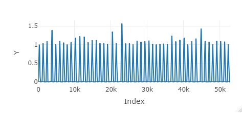
View the data using the Plotly method in Visualizing the entire data with R. It will be the analysis of the primary data .
library(plotly) #
setwd("C:/Rtest") #
Data <- read.csv("Data.csv", header=T)#
Data$Index <-as.numeric(row.names(Data))#
plot_ly(Data, x=~Index, y=~Y, type = 'scatter', mode = 'lines') #
 -->
-->
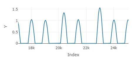
First of all, you can see the graph on the left, which shows that there are many small mountains. The graph on the right is enlarged, and you can see that there is a fixed value interval between the mountains. In the case of machine data, the interval of a certain value is often the case when the machine is stopped. In addition, a machine moves between one mountain to process.
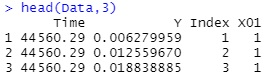
In the case of actual sensor data, the data that represents the state of the machine may be output from the machine, but it is not here, so I will create it. When the machine is stopped, Y seems to be 0, so use it to create data.
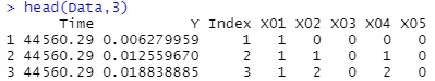
Data$X01 <- ifelse(Data$Y>0, 1, 0) #
Create a column (X02, X04) that starts from 0 each time the cycle changes and increases by 1 within the cycle.
Also, create a column (X03, X05) that increases by 1 each time the next cycle is reached.
X02 and X03 start when 0 changes to 1. Useful for analyzing 1.5th-order data.
X04 and X05 start when 1 changes to 0. Use this when you want to analyze whether the effect of stopping (when 0) occurs during operation (when 1).
Data$X02 <-Data$X01#
Data$X03 <-Data$X01#
Data$X04 <-Data$X01#
Data$X05 <-Data$X01#
n <- nrow(Data)#
Data[1,5] <- 0#
Data[1,6] <- 0#
Data[1,7] <- 0#
Data[1,8] <- 0#
for (i in 2:n) { <#
if (Data[i-1,4] == 0 && Data[i,4] == 1) { #
Data[i,5] <- 0#
Data[i,6] <- Data[i-1,6] +1 #
Data[i,7] <- Data[i-1,7] +1 #
Data[i,8] <- Data[i-1,8] #
} else if (Data[i-1,4] == 1 && Data[i,4] == 0){#
Data[i,5] <- Data[i-1,5] +1 #
Data[i,6] <- Data[i-1,6] #
Data[i,7] <- 0#
Data[i,8] <- Data[i-1,8] +1 #
} else {#
Data[i,5] <- Data[i-1,5] +1 #
Data[i,6] <- Data[i-1,6] #
Data[i,7] <- Data[i-1,7] +1 #
Data[i,8] <- Data[i-1,8] #
} #
} #
Up to this point, the 1.5th order data is available.
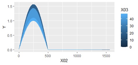
With the code below, you can create a color-coded graph for each cycle.
ggplot(Data, aes(x=X02,y=Y, colour=X03)) + geom_line() #
We will create secondary data and analyze it. Here, it is relatively general-purpose, and it is a way to create features that you should check once. It can also be applied when creating features that make full use of meta-knowledge .
library(dplyr)#
Data21 <- Data[Data$X01 == "0",] #
Data22 <- Data21 %>% group_by(X05)#
Data23 <- summarize(Data22, n_0 = n())#
Data31 <- Data[Data$X01 == "1",] #
Data32 <- Data31 %>% group_by(X05)#
Data33 <- summarize(Data32, n_1 = n(), Max_Y_1 = max(Y), Min_Y_1 = min(Y), Start_Time_1 = min(Time), End_Time_1 = max(Time))#
Data4 <- merge(Data23, Data33, all=T)#
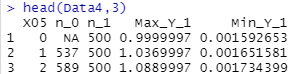
The variable names are as follows.
n_0: The number of data for which X01 is 0. In the case of this data, since it is data every second, it means that X01 is 0 time (seconds).
n_1: The number of data in which X01 is 1. In the case of this data, since it is data every second, X01 means a time (second) of 1.
Max_Y_1: Maximum value of Y when X01 is 1.
Min_Y_1: Minimum value of Y when X01 is 1.
If you draw a scatter plot with n_0 and Max_Y_1, they are neatly aligned. In other words, if X01 is 0 for a long time, the maximum value of Y is high.
It is difficult to obtain such analysis results just by looking at the primary data and 1.5th-order data, but it is easy to obtain with secondary data.
ggplot(Data4, aes(x=n_0, y=Max_Y_1)) + geom_point() #
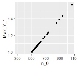
The meaning of the above analysis example is that "the maximum value when the machine is moving is proportional to the time when the machine is stopped immediately before that".
When there is something wrong with the processing of the machine, the first thing to look at is the data when the machine is moving. For example, when there is an abnormality in processing, it is noticed from this point of view that the Y data is high.
However, "Why are there times when it is expensive?" Cannot be understood by looking at the data when the machine is running.
At such times, investigating the situation of the time when the machine is stopped may be a hint for investigating the cause. In the above example, it may be a hint that there is a relationship between the time the machine is stopped and the maximum value of Y data.
The sample code on this page is designed to give you information when the machine is stopped. In the example on this page, when the machine is stopped, Y is 0 and a constant value, so nothing is done in particular, but it is good to find the maximum and minimum values ??of Y when the machine is stopped. Sometimes.
In factory data analysis, it is not the end of creating secondary data, and unless you create tertiary data in association with quality and machine status data , you will not be able to do what you want to do.
It would be nice if there was something like an ID that could be used for linking in the sensor data, but if there isn't, there is no choice but to compare the time data and link.
It is rare that programming can be done smartly, and sometimes it is necessary to manually link them one by one.
